What Are Spring Colors? Your Complete Guide to the Season's Most Radiant Palette

What Are Spring Colors? Your Complete Guide to the Season's Most Radiant Palette
Spring colors capture something unmistakable that first rush of warmth after months of grey. They're the hues that appear when the world wakes up: peach blossoms, turquoise skies, the electric green of new grass pushing through soil. But what exactly makes a color a "spring color," and why do these particular shades feel so right when the seasons change?
The answer lies in understanding how color theory intersects with the psychology of renewal. Spring colors aren't just arbitrary picks from a paint swatch they're rooted in the three dimensions that govern every shade: hue, value, and chroma. Spring's unique combination of these elements is what gives the palette its unmistakable brightness and energy.
The Three Dimensions That Define Spring Colors
Spring colors occupy a distinct place within seasonal color analysis, set apart from other palettes by three key characteristics working in concert.
The hue is always warm, dominated by golden, peachy, or yellow undertones. This warmth is non-negotiable the moment undertones turn cool, you've moved into summer territory. Spring colors borrow their warmth directly from sunlight, which explains why they feel so associated with the season's longer days.
The value runs light to medium-light, reflecting the season's airy, sunlit atmosphere. Think about what spring light looks like compared to the harsh shadows of summer or the muted grey of winter there's a translucence to it, a softness. Spring colors mirror this quality. They are never deep or shadowy.
The chroma is high, meaning colors are clear and vibrant rather than muted or dusty. This clarity is what gives spring colors their energy and "full of life" quality. These aren't pastel-by-default colors; they're bright, saturated shades that demand attention.
The Core Spring Color Palette
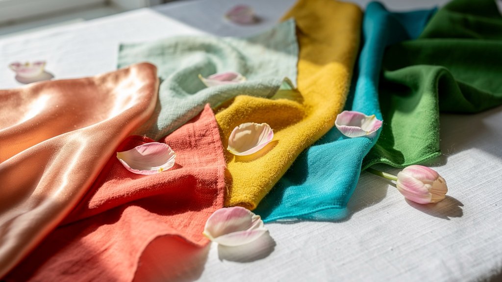
Now for the fun part the actual colors. The typical spring palette includes peach, coral, warm pink, bright turquoise, mint, sunny yellow, warm ivory, clear blue, apple green, and golden yellow. These aren't random selections; they're colors that share spring's warm-undertone DNA while varying enough to create a versatile, wearable wardrobe.
Peach and coral anchor the warmer end of the spectrum, offering a flush-of-spring-flower quality without overwhelming. They're flattering on a range of skin tones because their warmth mirrors the natural flush that comes with sun exposure the same reason these colors feel so seasonally appropriate.
The greens in spring's palette mint, apple green, and fresh green are distinctly warm rather than cool. This matters because cool greens can read as wintry or overly industrial. Spring greens should feel like the first leaves on a tree, tender and luminous.
Yellows deserve special mention. Butter yellow, sunny yellow, and golden yellow all work within the spring palette, but they must err on the warm side. The key is avoiding yellows with any green or grey undertone, which can make skin look sallow rather than glowing.
Understanding the Four Spring Seasons
Within the broader spring color family, color analysts actually identify four distinct sub-seasons. Each has a slightly different emphasis while maintaining spring's core warmth.
True Spring is the original spring season warm, bright, and highly saturated. Think of it as spring in full bloom. The palette includes warm greens, yellows, orangey reds, and peachy pinks, along with every shade of light brown from beige to tan. This is the most vibrant of the spring subtypes.
Light Spring takes the true spring colors and lightens them into a softer, gentler palette that works beautifully for those with lighter coloring. Clear pastels dominate chamomile tea yellow, light peach, and delicate versions of spring's brighter shades.
Clear Spring emphasizes the brightness dimension. These colors are vivid and high-contrast, perfect for someone who can carry off bold, statement-making shades. Navy, grey, charcoal, and turquoise all appear in this subtype, provided they maintain warm undertones.
Soft Spring introduces some muted quality while keeping spring's warmth. This creates a more sophisticated, understated palette that works for those who find true spring's brightness overwhelming.
Understanding which spring subtype you fall into can transform how you shop. A soft spring wearing true spring's most saturated coral will look washed out; the same coral on a true spring reads as radiant. This is why the "best" spring color depends entirely on your personal coloring.
Spring Colors in 2025 Fashion
If you're wondering what's currently trending, the spring 2025 runways offered a clear answer: pastels are having a major moment, but with a contemporary twist. According to Elle's fashion trend report, brands like Chloé and Chanel presented "contemporary reimaginings of this classic spring color trend," with pistachio green and butter yellow leading the charge.
The House of Colour, a personal color analysis service, noted that "spring and summer are the ideal times to break out citrus tones; this year, tangerine is the fruity shade of choice." Their 2025 color report also highlighted that "after butter yellow and powdery pink, mint continues to be a shade that works across seasons."
What's interesting about current trends is the emphasis on mixing pairing vibrant hues with subtle pastels to create dynamic, versatile outfits. This aligns perfectly with spring's natural diversity. The palette was built for layering and combination.
Pantone's Color of the Year for 2025, Mocha Mousse, is a warm brown that bridges seasonal gaps. While not exclusively a spring color, its warmth and richness make it adaptable to spring wardrobes, particularly as a neutral base that allows spring's brighter shades to pop.
Why These Colors Work
There's a reason spring colors feel so right when temperatures rise. Our perception of color is deeply tied to context and association. When we see peach, turquoise, and fresh green after months of slate grey and navy, our brains register the shift as renewal even before we consciously process what we're wearing.
Spring colors also have a practical dimension: they tend to reflect light rather than absorb it, which is why they're associated with warm-weather dressing. A mint green top feels cooler in perception than a black one, even at the same temperature not just psychologically, but rooted in the physics of color.
The warmth in spring colors also complements the natural flush that comes with sun exposure. As skin tones warm slightly in spring and summer, colors with golden undertones blend rather than compete. This is why the same coral that looked garish in December can look luminous in June.
That said, how much individual variation exists in what "reads" as a spring color is still debated among color analysts. Some argue for strict adherence to the warm-undertone rule, while others suggest that certain cool-undertone colors can work for some spring types if they're light and clear enough. Personal color analysis involves enough nuance that general guidelines are just that guidelines, not laws.

Building a Spring Wardrobe
If you're looking to incorporate more spring colors into your wardrobe, start with what flatters your existing coloring. If you're unsure of your spring subtype, begin with the core palette peach, coral, turquoise, mint, butter yellow and notice which shades make your skin look vibrant versus those that seem to drain color from your face.
One approach that rarely fails: anchor your wardrobe with a neutral that works across seasons (warm ivory, camel, or soft brown) and use spring's brighter colors as accents. A mint green scarf, a coral bag, a turquoise blouse under a neutral jacket these touches deliver spring's energy without requiring a complete closet overhaul.
The key is authenticity. Spring colors work best when they feel like an extension of the season itself fresh, warm, and full of possibility. Force them, and they read as costume. Let them happen naturally, and they become the most effortless thing in your closet.